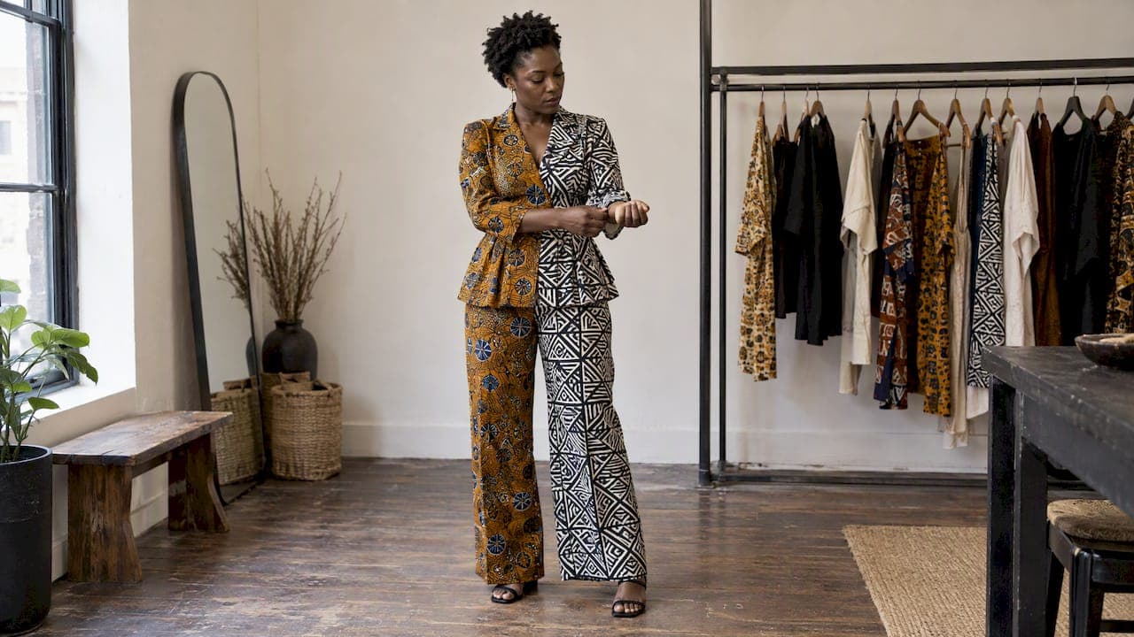
The fail-safe way to mix African prints is simple: pair one statement print with fitted neutral basics, or link two prints by repeating a shared color between them, which we like to call a chromatic thread. Try a bold Ankara skirt with a plain white tee and gold hoops, and the outfit reads intentional from the first glance. At Sena Nukunu, we build our collections around exactly this kind of confident, wearable mixing.
TL;DR:
- Pair one statement print with neutral basics or repeat a shared color in accessories to create cohesive African print outfits easily.
- Use a dominant large-scale print balanced with smaller prints and neutral elements to avoid visual overload.
- Match fabrics by weight and contrast textures to add depth without clashing visually, especially when mixing woven and smooth materials.
- Incorporate accessories like belts and scarves in a solid or shared color to ground bold prints, avoiding overwhelm from multiple patterns.
- Respect the cultural significance of prints by understanding their background and avoid ceremonial mimicry when styling for everyday wear.
Table of Contents
- Beginner moves: build outfits that never clash
- Color and undertones: making prints feel connected
- Scale, proportion, and balance: rules that keep prints harmonious
- Fabric and texture: what to match and when to contrast
- Accessories and grounding: small details that anchor bold prints
- Advanced mixing: intentional clashes and storytelling with prints
- Cultural context: reading meaning in African prints
- Author perspective: confidence, provenance, and styling with care
- How Sena Nukunu helps you practice mixing prints
- FAQ
- Sources
Beginner moves: build outfits that never clash
If you are new to mixing prints, start with combinations that carry built-in balance. A bold print paired with neutral, fitted basics lets the pattern do the talking while the rest of the outfit stays quiet, a principle fashion stylists consistently recommend for beginners.
- Pair a printed skirt with a plain white tee and simple sandals.
- Layer a printed jacket over black denim and a solid top.
- Wear a printed dress under a neutral cardigan or blazer.
Before you commit to a full look, run through a short checklist: pick one silhouette to anchor the outfit (fitted jacket with flowy pants, or a structured top with a loose skirt), keep one piece entirely neutral, and limit your prints to a few dominant colors until your eye adjusts.
Pro Tip: Start with accessories, a scarf or headwrap, before you try a full mixed-print outfit; it is the lowest-risk way to build confidence.

Color and undertones: making prints feel connected
The fastest way to make two different prints look like they belong together is to find a color they share and repeat it somewhere else in the outfit, a shoe, a belt, a lining. This repeated color acts as a visual anchor that ties the whole look together.
Undertones matter just as much as exact color matches. A print heavy in terracotta and gold carries a warm undertone, while one built on indigo and emerald leans cool. Matching undertones across prints is often a faster route to cohesion than hunting for identical colors, since warm and cool families tend to clash less when paired deliberately.
One shared color across two prints, echoed in an accessory, is often enough to make an entire outfit feel coordinated.
Try this: if your top has a rust-orange motif and your pants carry a small amount of the same rust in their pattern, a pair of rust-toned sandals pulls the whole combination together instantly.
- Scan both prints for one overlapping color before you commit to pairing them.
- Echo that color in a shoe, belt, or bag rather than adding a third print.
- When colors do not match exactly, match temperature instead, warm with warm, cool with cool.
Scale, proportion, and balance: rules that keep prints harmonious
Visual confusion in mixed-print outfits almost always comes down to scale. A dependable layout, sometimes called the dominant and secondary rule, divides an outfit into roughly three visual parts, with one dominant print, one secondary print, and one neutral or solid element balancing the composition.
- Let one print carry the outfit, a large-scale motif on a dress, skirt, or jacket, and treat it as a significant portion of the visual weight.
- Introduce a second, smaller-scale print, a fine repeat pattern on a scarf or blouse, so your eye has a place to shift without competing for attention.
- Fill the remaining third with a true neutral, black trousers, a cream top, or tan sandals, so the composition has somewhere to rest.
Pairing a large motif with a small repeat works because the eye needs a resting point between busy areas. A chunky geometric print on a jacket paired with a fine dotted pattern on a blouse, grounded by solid trousers, keeps the whole outfit readable instead of overwhelming.
Fabric and texture: what to match and when to contrast

Fabric weight changes how prints read next to each other, sometimes more than color does. Two lightweight cottons drape similarly and let patterns sit quietly together, while pairing a crisp cotton print with a heavy wool can make one piece visually dominate the other even when the colors coordinate.
Contrast in texture, rather than drape, is where mixing gets interesting. A woven kente piece next to smooth leather or a matte cotton print against a slight sheen adds depth without adding visual noise, since the eye reads texture separately from pattern.
- Match drape weight (light with light, structured with structured) when you want prints to blend seamlessly.
- Contrast texture, woven against smooth, matte against sheen, when you want visual interest without adding a third print.
- Remember that sheen intensifies perceived color, so a glossy print often looks bolder than the same pattern in a matte finish.
Accessories and grounding: small details that anchor bold prints
Accessories carry real weight in a mixed-print outfit, often more than people expect. A plain leather belt, neutral footwear, or minimal gold jewelry gives the eye a place to land between two busy patterns, while a printed scarf can double as the chromatic thread that ties separate pieces together.
- Use a solid belt or bag as a neutral resting point between two prints.
- Choose a printed scarf when you want to echo a shared color rather than introduce a third pattern.
- Keep jewelry minimal when your outfit already carries two strong prints.
Pro Tip: Save statement earrings or layered necklaces for outfits built around a single print, so accessories never compete with an already busy combination.
Advanced mixing: intentional clashes and storytelling with prints
Once the basics feel natural, mixing prints becomes a creative tool rather than a formula to follow. Confident stylists sometimes break the color-matching rule on purpose, placing warm and cool prints side by side or combining a geometric motif with a floral one for deliberate visual tension.
- Choose one element to clash on purpose, color temperature, motif type, or scale, while keeping everything else in the outfit disciplined.
- Build toward a concept rather than a formula: a fusion look that blends heritage prints with modern tailoring, a festival outfit with layered texture, or an editorial-style combination meant to be noticed.
- Let fit do the finishing work. A sharply tailored blazer or a well-fitted dress makes even the boldest print clash read as intentional rather than accidental, and posture carries the rest.
Designers who blend traditional motifs with contemporary silhouettes understand this instinctively: the clash only works when the tailoring is precise.
Cultural context: reading meaning in African prints
Mixing prints well also means understanding, at least a little, what they carry. Museum scholarship frames textiles like kente and adire as more than decoration, describing them as epistemologies in cloth that encode lineage, ceremony, and social identity.
Textiles function as narrative devices, carriers of lineage and ceremonial meaning rather than purely decorative motifs.
Hand-dyed adire and woven kente differ from industrially printed Ankara in both technique and cultural weight, and some motifs historically belong to specific social roles or ceremonies. When you are unsure of a print's background, the respectful path is to let it appear in a modern, blended outfit rather than attempt ceremonial mimicry. We lean on this kind of cultural storytelling in how we choose and present every piece we offer.
Author perspective: confidence, provenance, and styling with care
Mixing prints is creative play, but it carries a responsibility too. The combinations that feel most alive to us are the ones built with curiosity about where a motif comes from, not just how it photographs. Practice boldly, ask questions about provenance when a print feels unfamiliar, and let that respect shape your choices as much as your eye for color does.
— Sena
How Sena Nukunu helps you practice mixing prints
We offer ready-to-wear dresses, agbada sets, and statement pieces built specifically for this kind of styling, each one a strong enough anchor to build a mixed-print look around. Our Women's Collections and Woven Nobility and Woven Radiance lines give you a single standout piece you can pair with neutrals immediately or build toward bolder combinations over time.
Every piece comes from limited-quantity production rooted in West African craftsmanship, made for readers who want their mixed-print outfit to carry cultural provenance, not just visual appeal. Browse our collections to find the statement piece that anchors your next look.
FAQ
What is the easiest way to start mixing African prints?
Pair one bold printed piece with fitted neutral basics, a plain tee, solid trousers, or a neutral cardigan. This keeps the pattern as the clear focal point while the rest of the outfit stays simple and controlled.
How do I know if two prints will clash?
Check whether the prints share a color or a similar undertone, warm tones with warm tones, cool with cool. If they share neither, introduce a neutral piece or accessory to bridge them rather than forcing the two prints directly together.
Can I mix different fabric types when pairing prints?
Yes, mixing textures like woven kente with smooth leather or matte cotton adds depth, but keep drape weight similar between pieces if you want the prints themselves to read as cohesive rather than competing.
Is it disrespectful to mix culturally significant prints into everyday outfits?
Some motifs carry ceremonial or lineage-specific meaning, so it helps to research a print's background before wearing it in a casual context. When in doubt, choose prints in their modern, ready-to-wear form rather than styles tied to specific ceremonial use.
How many prints is too many in one outfit?
Most styling guidance suggests two prints as a strong starting point, with a dominant print, a secondary print, and a neutral piece dividing the outfit into balanced thirds. Beyond two prints, the look typically needs very disciplined color and scale control to stay readable.
Sources
- Sartorial Groundings: African Design at the Heart of Black Elegance - The Metropolitan Museum of Art
- How to Mix Prints Without Clashing, According to Fashion Experts | Teen Vogue
- V&A: restitution, repatriation, and textile context