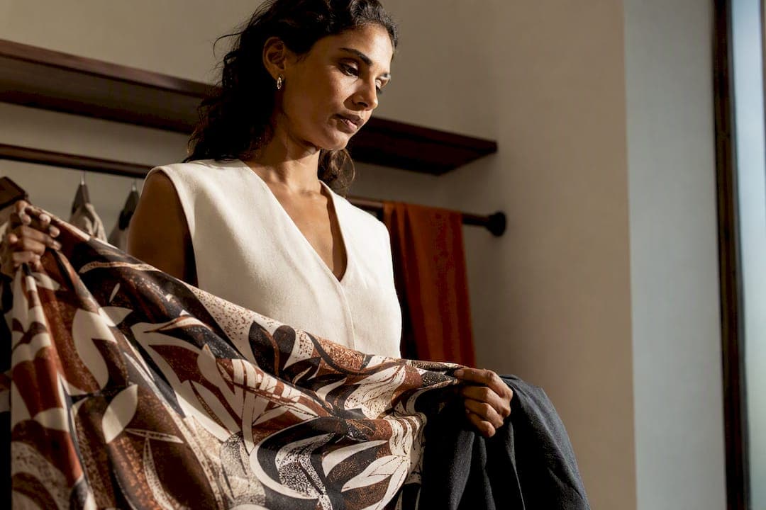
The easiest, most reliable way to wear bold prints is to make one printed piece the star and ground everything else in neutrals or a color pulled straight from the print. That single decision, more than any pairing trick or trend, is what separates a look that reads confident from one that reads chaotic. Sena Nukunu builds entire collections around this principle, because a well-chosen print doesn't need help competing for attention. It just needs the right frame.
TL;DR:
- Choosing one printed piece as the focal point ensures the look remains confident rather than chaotic, with neutrals or a color from the print grounding the outfit.
- Mixing two bold prints requires a shared color, contrasting scales, and limiting to two patterns, starting below the face for easier styling.
- Print scale and density affect how a pattern complements your body, with small dense prints skimming the figure and large sparse patterns emphasizing specific areas.
- Toppers like jackets or blazers in solid colors help balance busy prints, while accessories should stay minimal to prevent visual overload.
- Bold prints work in professional settings when paired with structured silhouettes and neutral layers, and they can transition across seasons with appropriate layering.
Table of Contents
- What Are the Core Principles of Bold Prints Styling?
- How Do You Mix Two Bold Prints Without Clashing?
- Does Print Scale Change How Prints Look on Your Body?
- Copyable Bold-Print Outfit Formulas for Every Occasion
- Which Accessories and Layers Make Prints Wearable?
- How Do You Wear Bold Prints Across Every Season?
- What Makes Sena Nukunu a Trusted Voice on Print-Forward Dressing
- How Should Skin Tone and Undertone Guide Your Print Color Choices?
- Can Bold Prints Work in Professional and Formal Settings?
- How Do Body Proportions and Height Affect Print Choice?
- Why Bold Prints Are Really About Confidence
- Shop the Sena Nukunu Pieces That Make This Easy
- Where to See More Bold-Print Styling in Action
- Sources
What Are the Core Principles of Bold Prints Styling?
A bold print already carries visual weight, color, movement, story. When you add a second loud element, you're not doubling the impact, you're diluting it. The one-wow-piece approach works because it gives the eye a clear place to land. Think of it the way a griot commands a room: one voice, full attention, everything else in support.
Silhouette matters just as much as color. A structured print piece, like a tailored dress or a sharply cut jacket, reads polished and intentional. A flowing print, like a wide-leg pant or a draped kaftan, reads relaxed and easy. Pick one lane per outfit rather than mixing a stiff silhouette with a loose one, which can make the proportions fight the print instead of supporting it.
Color harmony ties it together. Ground your printed piece with true neutrals (black, white, camel, navy) or pull one dominant color straight from the print into your shoes, bag, or belt. Animal prints get a special exemption here: leopard, snakeskin, and similar patterns function almost like neutrals, pairing easily with solids or even a second print.
- Do let one piece dominate and keep the rest simple.
- Do pull a single accent color from the print for your accessories.
- Don't pair two high-contrast prints of the same scale.
- Don't add busy jewelry or a printed bag on top of an already loud garment.
Pro Tip: If you're nervous about a new print, buy it in a piece you already know how to style, like a wrap dress or a straight-leg pant. Familiar shapes make unfamiliar patterns feel instantly wearable.
How Do You Mix Two Bold Prints Without Clashing?
Mixing patterns intimidates people because it looks like it requires an eye most of us don't think we have. It's actually a formula.
- Find a shared color. Two prints in unrelated palettes will fight. Two prints that share even one color, a rust orange in a floral and the same rust in a geometric border, will feel coordinated on sight.
- Vary the scale. Pair a large-scale print with a small-scale one. A big floral against a tight houndstooth or a fine pinstripe gives your eye contrast to process instead of visual noise.
- Limit yourself to two patterns. Stylists generally agree that a third print pushes an outfit from confident to costume.
- Assign a dominant and an accent. Let one print anchor the bigger surface area (a dress, wide pants) and the second show up in a smaller dose (a scarf, a cropped jacket, a headwrap).
- Start with proven pairings. Stripes and small florals. A tight polka dot and a geometric print in the same tone. Animal print with anything, since it behaves like a neutral.
Stylists tracking the recent rise of "printmaxxing" recommend a specific entry point for beginners: start the mix below the face, in a skirt or pant, then use a solid top to keep the second print from overwhelming the whole look.
Pro Tip: Photograph your outfit before you leave the house. Patterns that feel busy in the mirror often photograph as balanced, and vice versa, so a quick snapshot can save you a last-minute outfit change.
Does Print Scale Change How Prints Look on Your Body?
Scale and density do more work than most people realize. Scale is simply the size of the motif, small, medium, or large. Density is how closely those motifs are packed together, dense and busy versus sparse and spaced out.
Dense, small-scale prints tend to skim the body because the eye moves quickly across the pattern without pausing anywhere. Sparse, large-scale prints do the opposite. They slow the eye down and create emphasis wherever the motif lands, which is why a single oversized floral on a hip or bust reads as a deliberate focal point rather than an accident.
That focal point deserves attention. Look at where the largest or highest-contrast motif falls on your body before you buy. A stylist trick worth knowing: avoid letting that focal point land exactly where you'd rather not draw the eye, and instead let it highlight a feature you like.
- Petite frames tend to look best in small to medium-scale prints that don't overwhelm a smaller canvas.
- Curvier figures often benefit from dense, mid-scale prints that skim rather than sparse prints that can add unwanted bulk to a specific area.
- Taller frames can carry large-scale, high-contrast prints with room to spare.
Dense prints move the eye faster across a garment than sparse ones, which is why they read as more forgiving for anyone self-conscious about a specific area.
Copyable Bold-Print Outfit Formulas for Every Occasion
Confidence comes easier when you're not starting from scratch. These formulas work because each one follows the same logic: one print, one neutral anchor, one intentional shoe choice.
- Work: Printed midi dress + tailored blazer in a solid pulled-color + pointed flats or low heels + structured tote.
- Weekend: Printed wide-leg pant + plain white tee + denim jacket + white sneakers.
- Date night: Statement printed top + solid black trousers or a straight skirt + heeled sandals + one gold accessory.
- Vacation: Printed maxi dress or kaftan + flat sandals + a straw bag + sunglasses, no second print needed.
- Travel day: Printed scarf or headwrap + monochrome loungewear set + sneakers, letting the accessory carry the print load.
- Wedding guest: Printed matching set (top and skirt or pant in the same fabric) + metallic heels + a clutch in the print's accent color.
- Formal event: Printed statement dress + minimal jewelry + a solid clutch, letting the dress do all the talking.
Adaptation notes matter more than the formula itself. If you're petite, size the print to your frame rather than your outfit's occasion. If the setting calls for more formality, swap sneakers for heels and simplify the jewelry rather than changing the print itself. Translating a bold print into work-appropriate territory almost always comes down to the topper: a blazer or structured cardigan instantly signals "polished" no matter how loud the pattern underneath.
Which Accessories and Layers Make Prints Wearable?
Toppers do more heavy lifting in print styling than any other category. A blazer, a denim jacket, or a long cardigan in a solid color instantly grounds a busy piece and gives you an easy way to tone the intensity up or down depending on where you're headed.
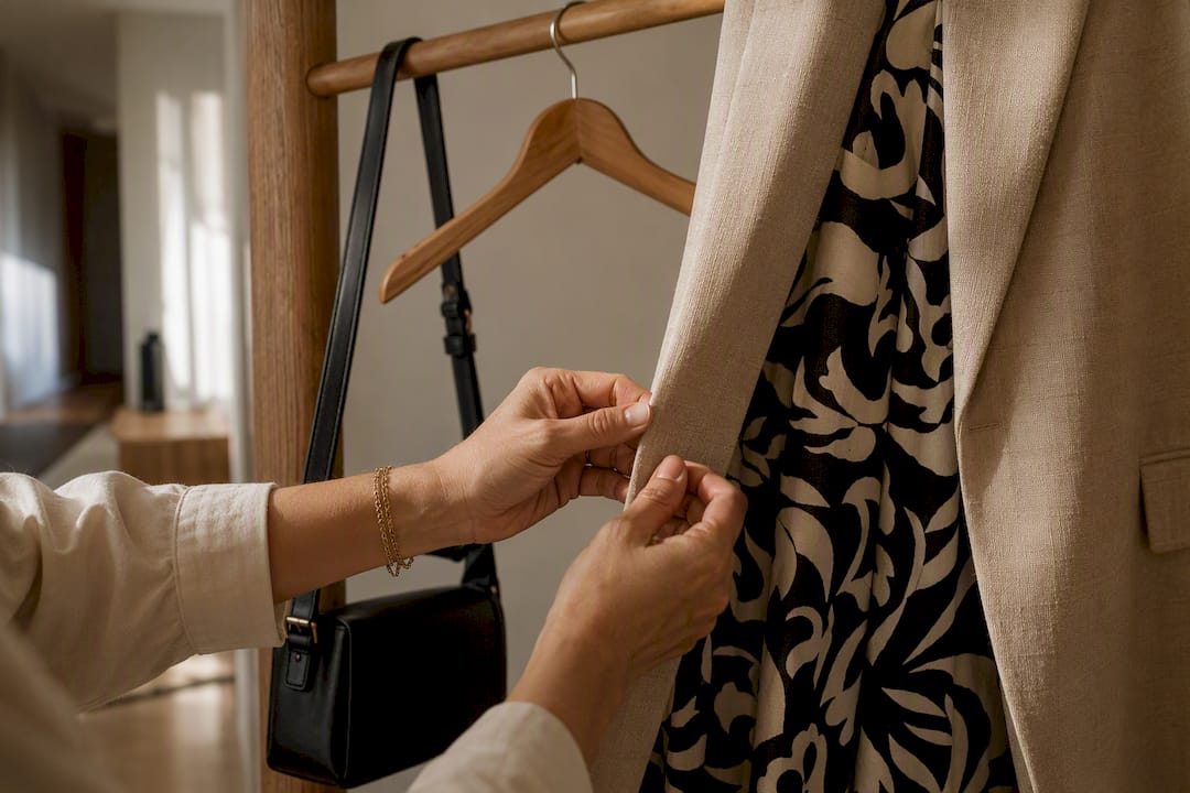
Accessories should generally scale down, not up. If your garment is loud, keep jewelry delicate and bags simple in shape. Texture can substitute for pattern here: a woven straw bag or a smooth leather belt adds interest without competing.
Belting is an underused trick specific to prints. A wide belt over a printed dress or kaftan defines your waist and breaks up a large-scale pattern into a top half and bottom half, which reads more intentional than one uninterrupted sweep of print.
- Choose one neutral topper (blazer, jacket, cardigan) as your default grounding move.
- Keep jewelry minimal, one statement earring or cuff, not both.
- Use a belt to define shape when the print piece is loose or oversized.
- Reserve a printed accessory, like a scarf, for days you want a print without committing to a full garment.
Pro Tip: Keep one neutral clutch or crossbody in a color that matches every print you own. It becomes your default "I don't have to think about this" accessory.
How Do You Wear Bold Prints Across Every Season?
The same printed dress can work in July and January if you change what surrounds it, not the piece itself.
In summer, let the print stand alone with minimal layering: bare arms, sandals, and light fabrics like cotton or rayon that let the pattern breathe. In fall and winter, layer a turtleneck underneath, add tights, and swap sandals for boots. The print stays the star, but the temperature dictates the supporting cast.
Transitional weather calls for a layering sequence: printed piece, thin neutral layer (a fitted turtleneck or tank), structured topper, then a scarf if needed. Each layer should stay solid so the print never has to compete.
- Packing for travel: Pack one or two print pieces and build every outfit around neutral basics you can rewear.
- Cold-weather swap: Trade sandals for boots and add tights in a color pulled from the print.
- Warm-weather swap: Drop the topper entirely and let the print piece stand on its own.
What Makes Sena Nukunu a Trusted Voice on Print-Forward Dressing
This brand operates with a simple standard: every printed piece is produced ethically, in limited runs, working directly with artisans who understand these patterns as inheritance, not decoration. That's a different starting point than most fashion brands, and it shapes how prints get designed and placed on the body.
West African textile traditions have organized bold pattern and matching-set dressing for centuries, long before "printmaxxing" had a name. A wax-print two-piece or an agbada set isn't an experiment in mixing prints. It's a coordinated system where color, scale, and placement were resolved before the fabric ever left the loom.
- Matching sets solve the mixing problem entirely, since the print is coordinated across the top and bottom.
- Limited-quantity production means each piece carries more intention and less mass-market repetition.
- Manufacturing practices connect the garment back to the artisans who made it.
For readers who want to go deeper on the confidence side of this, The brand's blog covers statement pieces and personal expression and a practical workflow for building statement outfits from the ground up.
How Should Skin Tone and Undertone Guide Your Print Color Choices?
Undertone, not skin depth, decides which print colors will make your complexion look lit from within versus washed out. Warm undertones (gold or peachy casts) tend to glow in prints built around rust, olive, warm coral, and mustard. Cool undertones (pink or blue casts) generally do better with jewel tones, true reds, and cool blues within a print's color story.
You don't need to overhaul your print choices around this, just use it as a tiebreaker. If you love a print that runs warm overall but has one cool-toned motif in it, you can pull that cool accent into your accessories to bring the whole look closer to your undertone. The reverse works too.
Deeper skin tones can carry high-saturation, high-contrast prints, think vivid reds, deep purples, and bold black-and-white geometrics, without the color reading as costume-like. Lighter skin tones often find that mid-saturation prints avoid an overly stark contrast against the skin. Neither rule is a limitation. It's simply about knowing which prints will do the most flattering work with the least effort.
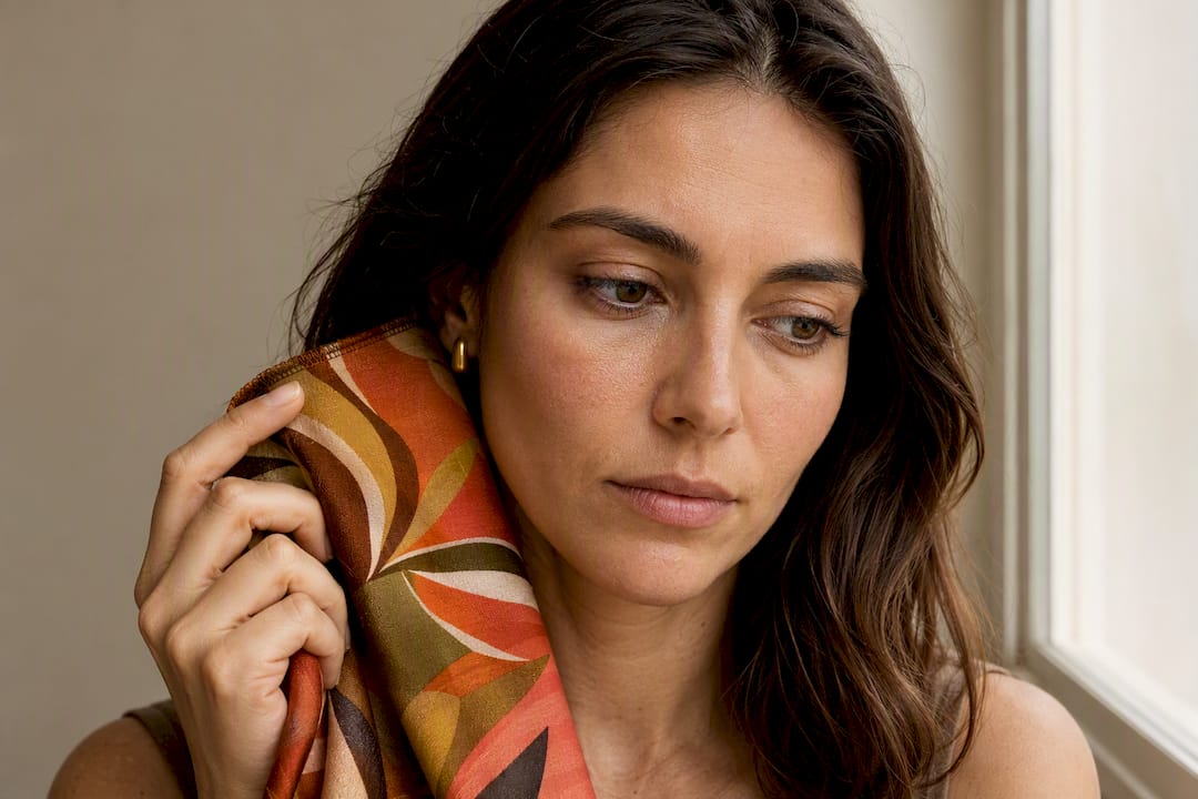
When in doubt, hold the fabric up near your face before committing to a full look. If the print makes your skin look brighter and more awake, that's your answer. If it flattens or dulls your complexion, save that print for a piece worn away from the face, like a skirt or pant, where undertone matters less.
Can Bold Prints Work in Professional and Formal Settings?
Bold prints belong in the office more than most dress codes suggest, as long as the silhouette and supporting pieces do the formal work the print itself doesn't need to do.
Start with structure. A printed sheath dress, a tailored printed blazer, or a matching print set in a crisp fabric reads professional because the cut signals intention. The same print in a flowing, casual silhouette can shift the entire outfit toward weekend territory.
Keep the print contained to one piece and let a blazer, cardigan, or trouser in a solid neutral carry the rest of the outfit. This is the one-wow-piece rule doing double duty: it keeps you print-forward without pulling focus from a client meeting or a formal event.
For genuinely formal settings, like a black-tie dinner or a wedding, lean toward prints with a metallic thread, a jewel-toned palette, or a fluid fabric like silk, since these signal occasion-appropriate polish even when the pattern itself is bold. Pair with minimal, refined jewelry and let the print be the entire statement rather than one element among several.
If your workplace runs conservative, start small: a printed blouse under a solid blazer, or a printed scarf with an otherwise neutral suit. Build up to a full printed dress or set once you've gauged how much room your environment gives you to experiment.
How Do Body Proportions and Height Affect Print Choice?
Proportion, not size, is the real variable in print styling. A print that looks stunning on a tall frame can overwhelm a petite one not because of body size but because of the ratio between the print's scale and the amount of fabric it covers.
If you're petite, favor small to medium-scale prints and keep the print concentrated in one garment rather than head-to-toe. A petite frame in an oversized, large-scale print can end up wearing the print instead of the other way around.
If you're tall, you have room to play with large-scale, high-density prints, and you can experiment with head-to-toe print in a single matching set without it looking costume-like, since your frame gives the pattern space to breathe.
For curvier proportions, dense, mid-scale prints tend to skim and flatter more reliably than widely spaced, large motifs, which can add unintended visual bulk exactly where the sparse spacing lands. A vertical print orientation, stripes running top to bottom or a print with a strong vertical repeat, can also elongate the frame.
Whatever your proportions, the focal point rule still applies: know where a print's boldest motif lands on your body, and choose pieces where that placement highlights what you want highlighted.
Why Bold Prints Are Really About Confidence
Prints speak before you do. Choosing a bold pattern, especially one rooted in cultural tradition, is a form of nonverbal storytelling, a way of saying something about identity, heritage, or mood before anyone hears your voice.
Start small if you need to. One printed scarf. One statement top. Let it build. Confidence with prints isn't a personality trait some people are born with, it's a muscle you build one worn outfit at a time. Sena Nukunu exists because that experimentation deserves pieces made with real craftsmanship behind them, not shortcuts. Explore what fashion as self-expression can look like once you stop asking permission to be seen.
— Sena
Shop the Sena Nukunu Pieces That Make This Easy
The brand offers pieces designed so the print-mixing decisions, scale pairing, and color anchoring are already resolved before it reaches you, which means you skip the guesswork and go straight to wearing it well.
Start with a printed dress if you want the one-wow-piece rule in a single, ready-to-wear garment, or explore a matching set for a coordinated print system with zero mixing required. Pieces are produced ethically and in limited quantities, emphasizing craftsmanship. Browse the full collections to find a print that fits your undertone and proportions, or head to the Sena Nukunu homepage to see what's currently in stock before a limited run sells out.
Where to See More Bold-Print Styling in Action
For readers who want to study real examples before building their own outfit formulas, these sources cover the techniques referenced throughout this guide:
- How to style print, on the printmaxxing trend and starting print mixes below the face.
- Tips for how to mix prints in fashion, on treating animal prints as neutrals.
- How to Wear a Bold Print, on scale, density, and focal-point placement.
- Rules of Wearing Statement Pieces, on the one-standout-piece principle.
- Animal print outfits are back, a styling playbook for working animal prints into everyday looks.
Sources
- How to style print — Harper's Bazaar
- Tips for how to mix prints in fashion — InStyle
- How to Wear a Bold Print — The Velvet Runway
- Rules of Wearing Statement Pieces — Maps Studio